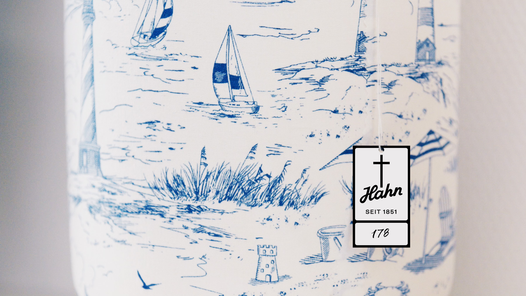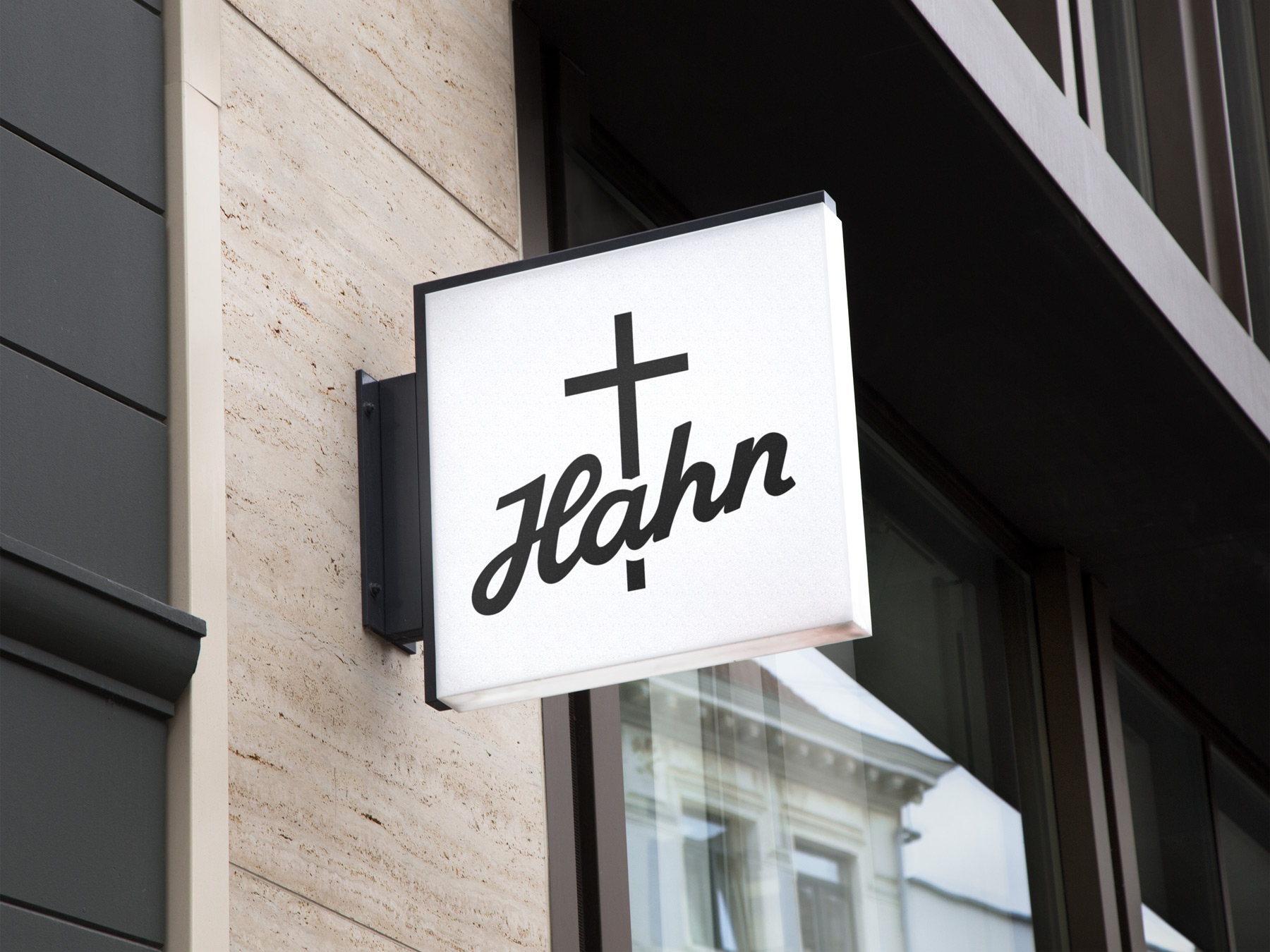
The unique lettering of “Hahn Bestattungen” Brandname has been the symbol of the family owned business for generations.
That’s why the redesign of the brand was build upon the strengths of the original, with optimized readability and appearance, with individual graphic elements having more room to breathe. Together with a bold new typography and digital optimization the brand is now entering the new era.