Of mice and men #2
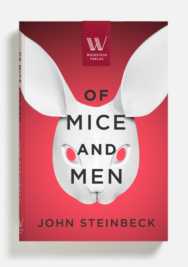
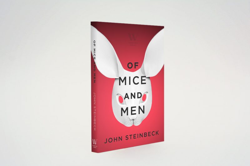
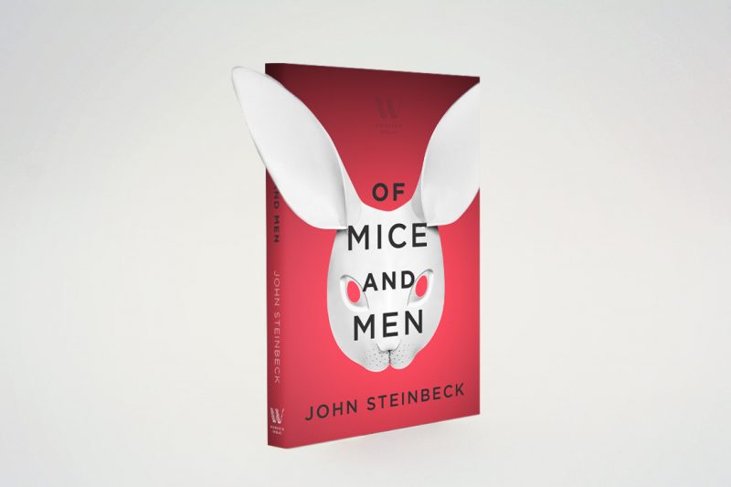
The idea for this version of the cover for “Of mice and men” was to use the symbolism of the rabbit from the previous concept and to make it bolder. Combining it with an idea of masks hiding the true nature of oneself brings more depth to the meaning.
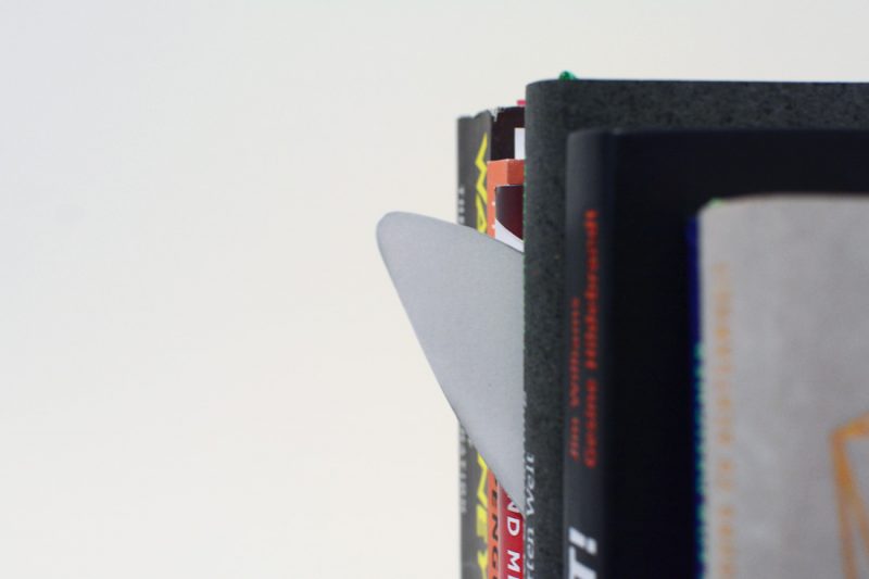
As a small visual gimmick, I put the ear of rabbit as an extended element out of the cover to draw the eye when positioned on a shelf.


